UX design tips to improve your business website
Benaiah Barango
SoPlugged team
Apr 4, 2023
As an entrepreneur, you likely understand the importance of having a strong online presence. One key component of a successful website is its user interface (UI) and user experience (UX). UI refers to the visual design of a website, while UX is concerned with how easy and intuitive it is for users to navigate and interact with the site. UX design is the process of creating a seamless and enjoyable experience for your users which can impact their likelihood of shopping with you.
Why does UX design matter
In today's digital world, customers expect a seamless and intuitive experience when interacting with your business online. Data shows that your customers are ~200% times more likely to shop with you if they have a great experience on your website.
With such an impact UX has on your business's success, it seems like a smart investment to do it right. In the following sections, you'll learn 5 easy-to-implement changes to apply to your website that will greatly improve the overall experience.
Simplify the Navigation
Navigation is an essential aspect of UX. It helps users find the information they need quickly and easily. A cluttered and confusing navigation menu can frustrate users and drive them away from your website.
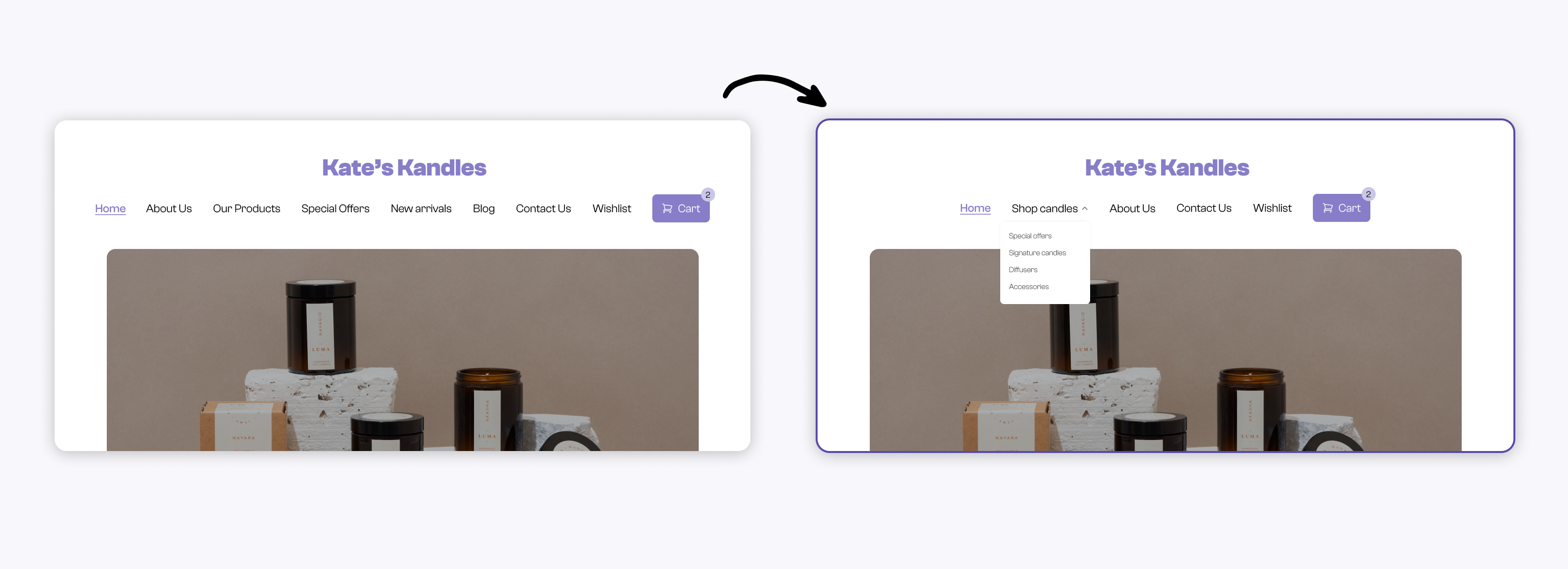
To simplify navigation, limit the number of menu items and use clear and concise labels. Prioritize your most important links, and use drop-down menus for less important ones. You could also include a search bar to make it easy for users to find specific content. If you’re using an e-commerce website builder like Shopify, this is available to you right-away.

Left: Website with a busy navbar. Right: Website with an organized navbar
Make it mobile-friendly
It’s no secret that mobile device usage is at an all-time high and a lot of your visitors are likely coming from your social media page on their phones/tablets, so having a responsive website is in your best-interest as an entrepreneur.
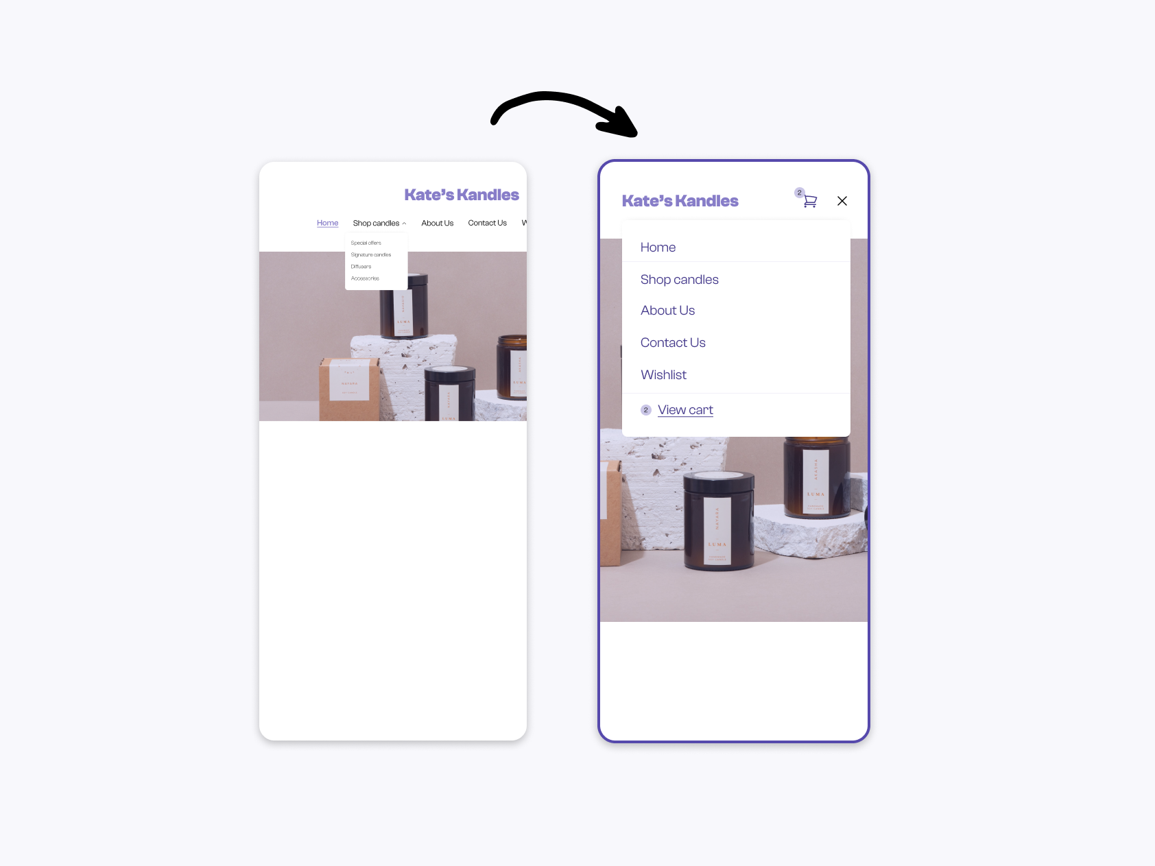
A responsive design ensures that your website is optimized for different screen sizes (phones, tablets and laptops), providing a seamless user experience across all platforms. Use large fonts, clear calls-to-action, and easy-to-click buttons to make it easy for users to interact with your website on a mobile device. Again, many website builders like Shopify and Wix offer templates that are optimized for mobile devices, so you don’t have to start from scratch.

Left: Mobile view with navbar extending out of the screen. Right: Mobile-friendly website
Optimize Website Speed
Website speed is a critical factor in UX. Users expect fast-loading websites, and a slow website can lead to frustration and abandonment. A fast-loading website not only enhances UX but also improves search engine rankings, which can drive more traffic and conversions. Check out our previous article about improving your website speed.
Have Clear Calls-to-Action
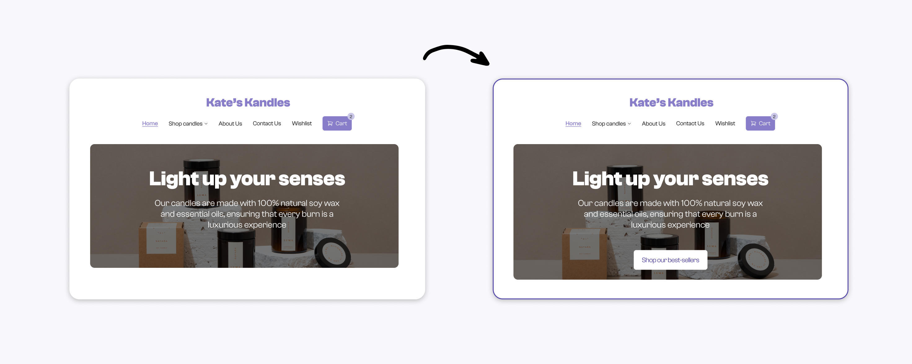
This one might be a little obvious, but don’t leave your users lost as to how to book your service or purchase a product! To make your Calls-to-Action (CTAs) effective, they should be clear, concise, and prominently displayed. Use contrasting colors to make them stand out, and place them above the fold to ensure they are visible without scrolling. Additionally, use action-oriented language, such as "Shop our best-sellers" or "Book now," to encourage users to take action.

Left: Website without a CTA. Right: Website with CTA
Accessibility
Accessibility is an essential aspect of UI/UX design that is often overlooked. Accessibility means designing websites that are accessible to all users, including those with disabilities (temporary or permanent).
While this section can’t quite cover the broad topic that accessibility is, here are two common pitfalls I notice in websites:
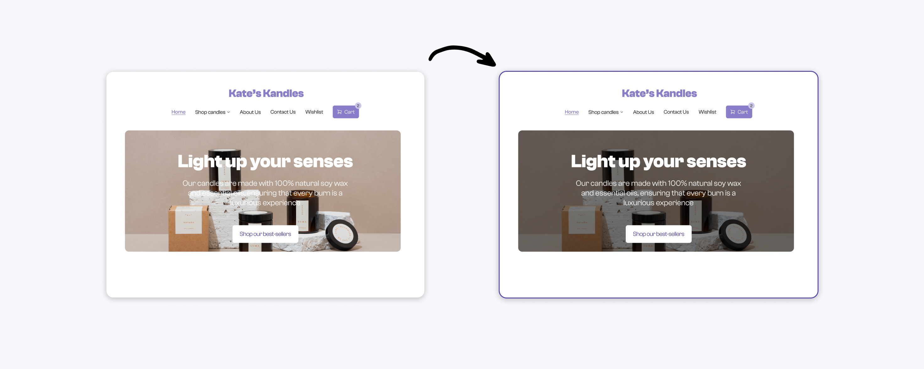
Color contrast: It's important to ensure that there is sufficient contrast between text and background colors to make the text easily readable. When unsure, use tools like https://contrast-ratio.com/ to make sure you pass the minimum threshold set by WCAG. In cases where you have a text over a background image, make sure to darken the image and use a well-contrasting text color, or vice-versa.

Left: Hero section with low contrast background. Right: Website with improved background contrast
- Missing alt text for images: Non-decorative Images should be accompanied by descriptive alt text that provides context for users with visual impairments as well as website crawlers. This alt text should accurately describe the content of the image, and should be concise and descriptive. See Shopify’s guide on adding alt text to your product images
Conclusion
By implementing these UI/UX tips, you can create a user-friendly website that enhances the user experience and drives conversions for your business. Remember, your website is often the first point of contact between you and your customers, so it's important to make a great first impression.
Reach out to our Pro team if you’d like help building a website for your business that your customers will love!